Case study · Design

Several agencies had tried.
This one was approved first time.

Marceting is a digital marketing agency. It had been through several identity attempts, with several agencies, and had accepted none of them. We built the whole system on the name.

All case studies

Marceting

The name was already doing the work.

  • Division Origin
  • Work Visual identity
  • Year 2026
  • Sector Digital marketing
The Marceting monogram, an m and a drawn as one ligature, reversed in white on vermillion red.

The situation

Marceting was launching, not rebranding. There was no existing mark to improve on and no equity to protect. Everything was waiting on a decision.

Before us, the identity had been attempted more than once, with more than one agency, and none of it had been accepted. The reason given each time was the same. It did not feel like them, and it would not land with the people they were trying to reach.

That is a worse position than it looks. A launch cannot move without a mark, and every rejected round makes the next one more cautious rather than more accurate.

The decision

An agency that cannot brand itself has a credibility problem before it opens its mouth. So the identity had to work as proof, not as packaging.

The name was already carrying two ideas at once. Marcela plus marketing gives Marceting, so the founder is inside the company name. And marc is one letter from mark, which is the thing a marketing agency is actually hired to leave.

We took that as the brief rather than as a coincidence to design around. Put your marc on the market. Leave your marc. Marc your spot. One idea, carried by the logo, the language and the layout at the same time.

We also pointed the register at the audience Marceting sells to. Consumer, social-first, fast. Not the sober corporate default a marketing agency is expected to reach for.
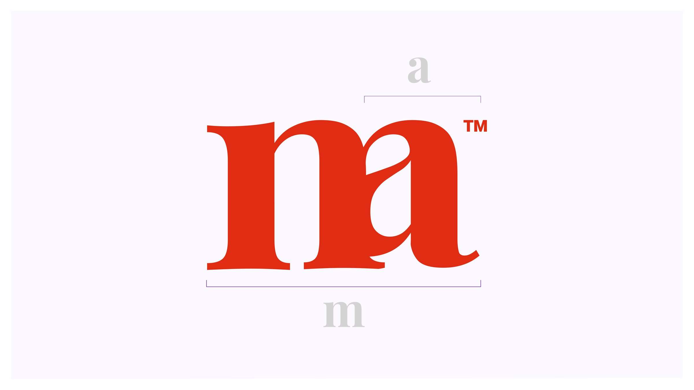
Construction diagram of the monogram, showing the lowercase m and a bracketed above and below the single combined ligature.
The monogram, constructed
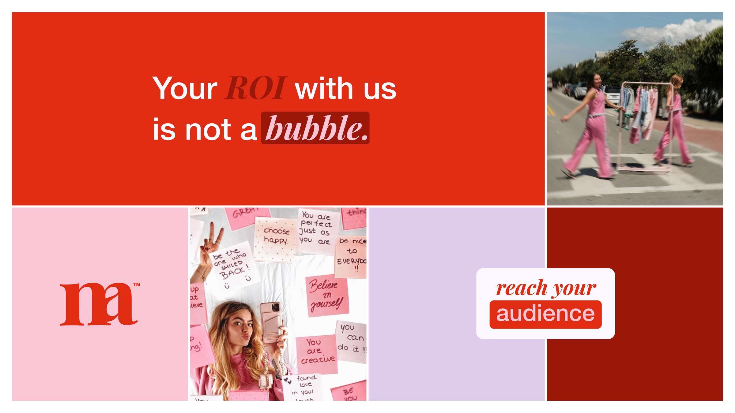
Identity system laid out as tiles: the wordmark on red, the monogram on pink, and caption blocks reading put your marc on the market and leave your marc.
The system, tiled
Headline reading your ROI with us is not a bubble, set in white on vermillion with the word bubble marked by a darker red highlight block.
The highlight block, marking one word
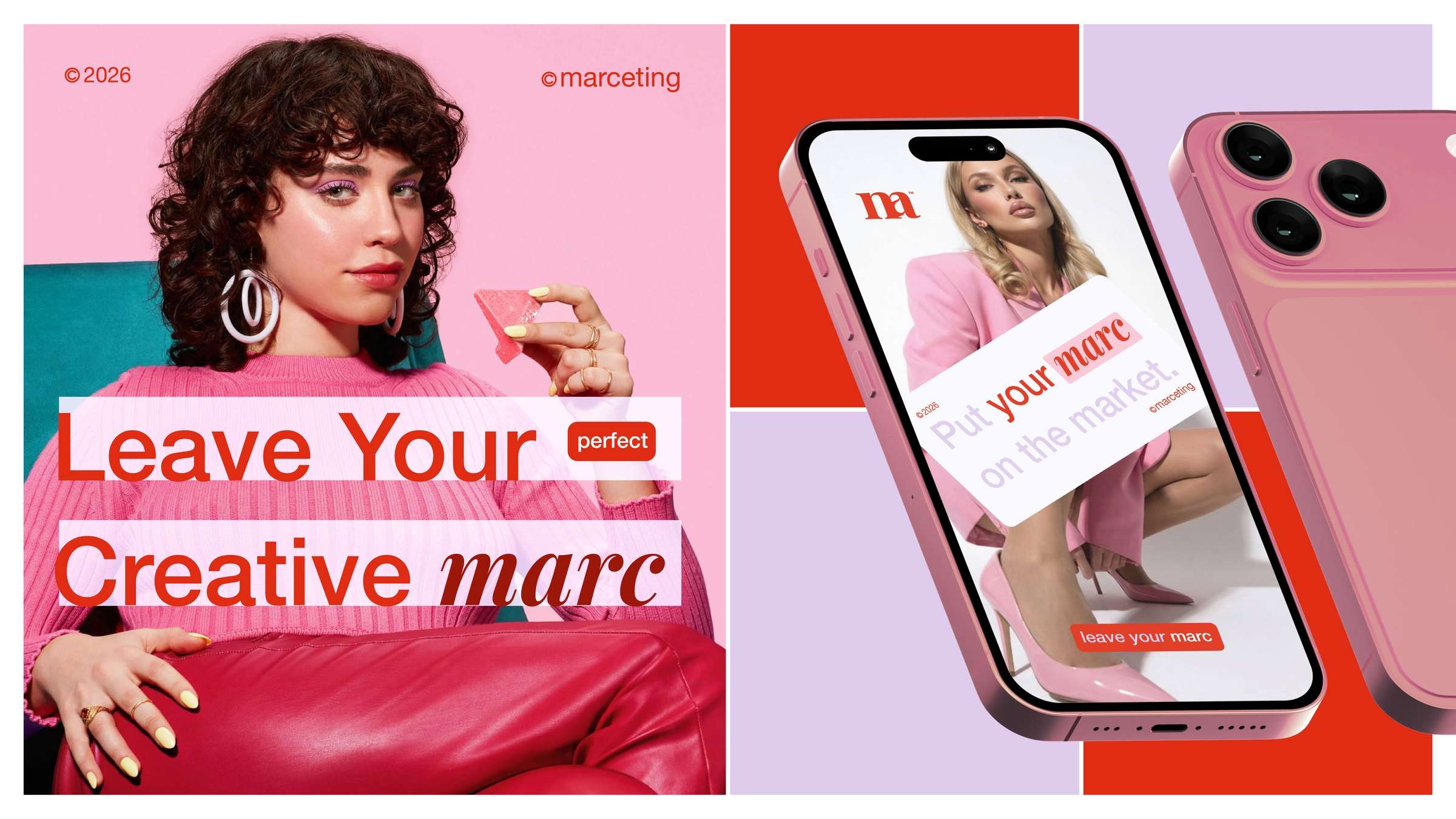
The identity applied to a social post and a phone screen, with rotated caption blocks over photography.
Applied to social and in feed
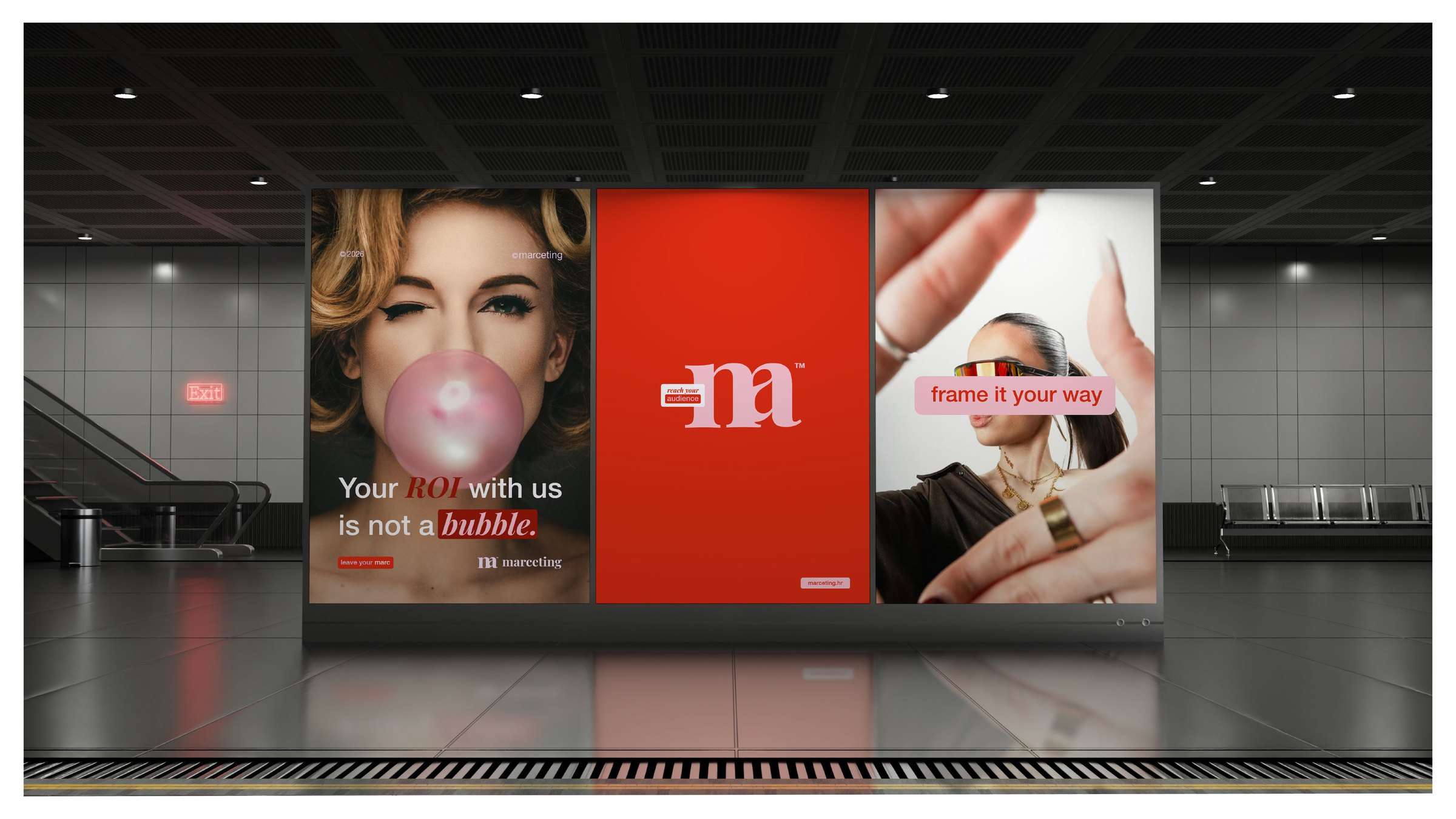
Three-panel transit poster site carrying the identity: the bubble headline, the monogram on vermillion, and a caption block reading frame it your way.
Out of home, three panels, one mark
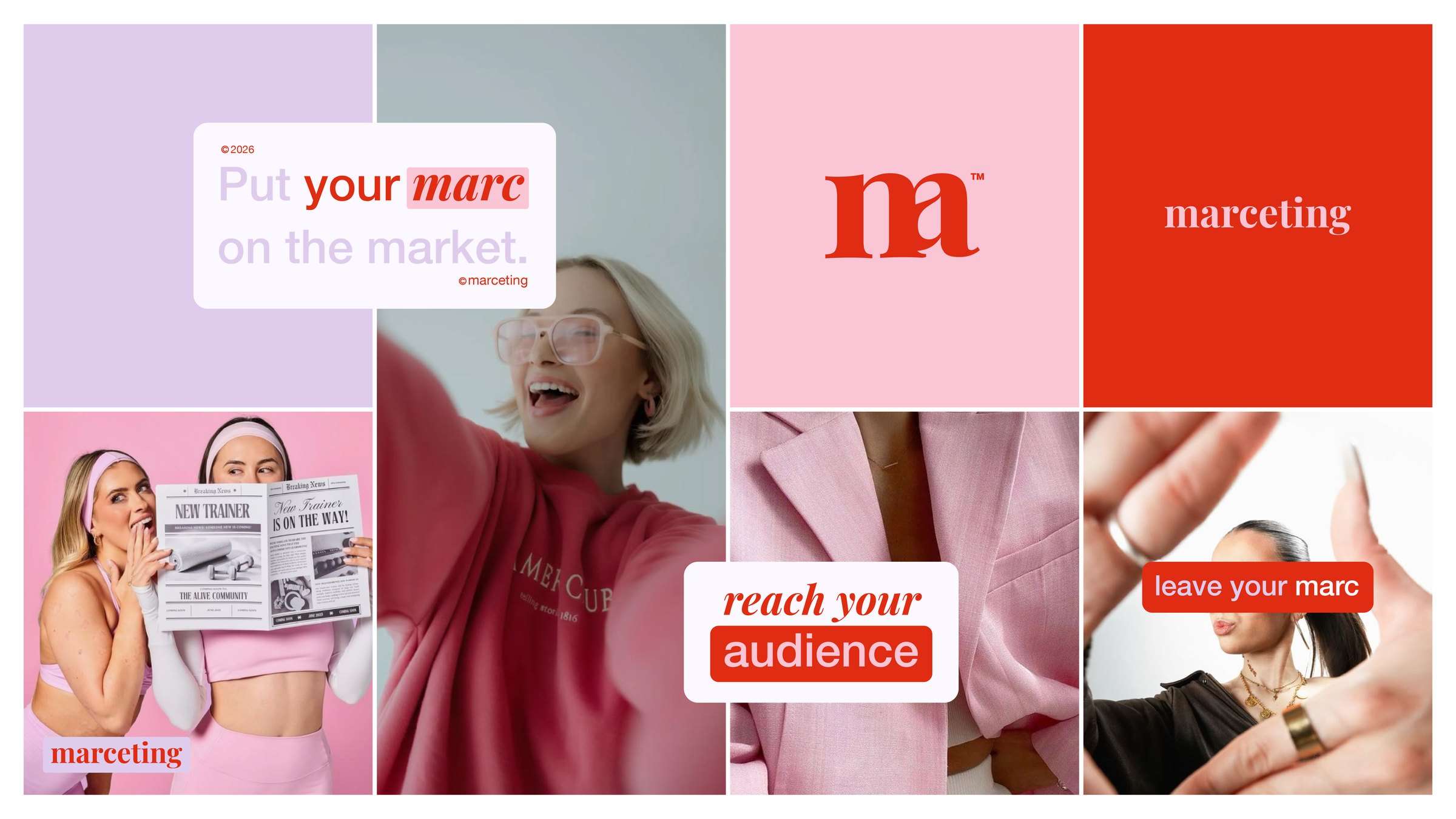
Twelve-frame grid setting the image direction: high-key studio and street photography, pink dominant, expressive and social first.
The look and feel

What we built

A monogram, not a lockup. The m and the a are drawn as one ligature, the bowl of the a sharing the final stem of the m. Her initial and the company’s, in one shape. It survives a favicon.

A two-voice type system. Playfair Display carries the name and the single word that matters in any sentence. Helvetica Neue carries everything else. The contrast between them is the hierarchy, so nobody has to be taught it.

A palette with a job for each colour. Vermillion for the mark and the claim, deep brick for weight, soft pink and lilac for ground, off-white for air.

Why it holds

A device that repeats the idea. Every caption sits in a rounded block, a mark left on the page. It works as a chip, as a bar behind one word so the word reads as marked rather than merely coloured, and as a sticker over a photograph.

The system is reproducible by someone who was not in the room. The monogram is one shape. The highlight block is one rule. Choosing which word goes in Playfair is a decision anyone gets right on the second try.

That matters more for an agency than for most clients, because an agency applies its own brand every working day, at speed, with nobody standing behind it.

Presented once. Approved once.

After several attempts elsewhere that were not. The decision that had been holding up the launch took one meeting.

Scope

  • Naming strategy and verbal identity
  • Monogram and wordmark
  • Typographic system
  • Colour palette
  • Layout device and caption system
  • Art direction and image direction
  • Application to social, digital and out of home

Credits

  • Brand strategy and identity Umbrella Origin
  • Art direction Nikola Zubak
  • Client Marcela Kokot, Marceting

Typefaces

  • Playfair Display
  • Helvetica Neue

Is your situation
one of these?

Tell us where the business is today and what has to happen next. You do not need to know which division you need. Working that out is the first thing we do.

Or skip the form

hello@umbrella-co.eu

Describe the situation and we will tell you honestly whether we have run it before. We reply within two business days.